Gameface UI: Adding a tutorial to the Menu UI
11/3/2025
Martin Bozhilov
In the latest GameFace UI update , we introduced a brand-new Tutorial component that allows developers to create interactive tutorials within their games UIs. To demonstrate its capabilities, we revamped the Menu UI to include a tutorial that guides users through its features.
Overview
In this article, we will walk you through the steps taken to integrate the Tutorial component into the Menu UI. Explaining some of the key features of the Tutorial component along the way.
Tutorial structure
The goal of the menu’s tutorial is to guide users through the main features of the Menu UI, including:
- the layout structure,
- the tab navigation,
- the main dynamic scrollable content area,
- the interactive side panel and,
- the interactive components
Each tutorial step focuses on one of these features, providing a short explanation and highlighting the relevant element in the interface. Some steps also include interactive actions that the user must complete before continuing.
Setting up the Tutorial component
Defining the tutorial steps
We’ll start by defining the steps for our tutorial.
To make them easy to manage and reuse, we’ll store them in a single TutorialSteps object.
Each step defines its order, title, and description, and corresponds to a specific feature of the Menu UI.
1export const TutorialSteps = {2 Intro: {3 order: 1,4 title: "Welcome to the Menu UI Sample",5 content:6 "This screen showcases how Gameface UI can be used to build a complete in-game settings menu.",7 },66 collapsed lines
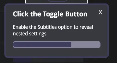
8 Tabs: {9 order: 2,10 title: "Menu Tab Navigation",11 content:12 "We're using the Tabs and TabLinks components to handle section switching. Each tab dynamically renders its own content without reloading the layout.",13 },14 Structure: {15 order: 3,16 title: "Layout Structure",17 content:18 "The main layout is split into two parts: the left 8 columns hold the main content, while the right 4 columns host contextual information and interactive elements.",19 },20 Scroll: {21 order: 4,22 title: "Scrollable Container",23 content:24 "This section uses the Scroll component, which auto-adjusts its height based on the tab's content and conditionally provides a scroll handle when needed.",25 },26 Collapsable: {27 order: 5,28 title: "Collapsible Options",29 content:30 "Some components can be expanded or collapsed. Try it out by toggling the \"Subtitles\" option.",31 },32 Interactive: {33 order: 6,34 title: "Click the Toggle Button",35 content:36 "Enable the Subtitles option to reveal nested settings.",37 },38 Dynamic: {39 order: 7,40 title: "Dynamic Options",41 content:42 "Notice the nested options that appeared! These settings are revealed based on parent option states.",43 },44 InfoPanel: {45 order: 8,46 title: "Component Info Panel",47 content:48 "The right panel updates based on your selection, providing additional information and context for each menu option.",49 },50 InteractiveTwo: {51 order: 9,52 title: "Interactive Panels",53 content:54 "Some panels have interactions that reflect changes in the menu. Try adjusting the color picker's value.",55 },56 ColorChange: {57 order: 10,58 title: "Component Reacts to Interaction",59 content:60 "Watch how the menu item's background color updates to match the ColorPicker component's value in real-time.",61 },62 Footer: {63 order: 11,64 title: "Static Footer Controls",65 content:66 "The footer displays a static list of keyboard shortcuts for quick navigation throughout the menu.",67 },68 End: {69 order: 12,70 title: "End of Tour",71 content:72 "That's the overview of our Menu UI sample. Feel free to explore and extend this sample to fit your project needs.",73 }74} as const;This structure keeps everything centralized — if you ever want to update a title or description, you only need to change it in one place.
Initializing the Tutorial component
Next, we initialize the Tutorial component at the root of the Menu UI.
Since the tutorial will highlight multiple elements across the interface, it needs access to all child components.
1import Tutorial, {TutorialRef} from "@components/Complex/Tutorial/Tutorial";2
3const Menu = () => {4    let tutorialRef: TutorialRef | undefined5    // Existing code...6    return (7        <MenuContext.Provider value={MenuContextValue}>8            <Tutorial ref={tutorialRef} outset={5}>9                {/* Existing Menu UI code... */}10            </Tutorial>11        </MenuContext.Provider>12    );13}
We attach a ref so the tutorial can be controlled programmatically.
The outset prop defines how much space surrounds the highlighted element, which helps prevent overlapping visuals and keeps the focus area clean.
Wiring the tutorial steps
Each tutorial step is added by wrapping a UI section with a <Tutorial.Step> component.
Every step must include an order (to define sequence) and can optionally include title and content to display inside the tooltip.
1<Tutorial.Step order={TutorialSteps.Tabs.order} content={TutorialSteps.Tabs.content} title={TutorialSteps.Tabs.title}>2 <Flex direction='row'>3 <For each={OPTIONS}>4 collapsed lines
4 {(tab) => {5 return <TabLink class={styles.link} location={tab} activeClass={styles.active}>6 <Flex align-items="center" justify-content='center'>{tab}</Flex>7 </TabLink>8 }}9 </For>10 </Flex>11</Tutorial.Step>By referencing data from the TutorialSteps object, you keep your setup clean and consistent. This makes it easy to reorder, update, or remove steps later without touching the actual UI code.
You can also fine-tune each step individually using:
position— manually defines where the tooltip appears relative to the highlighted element for this step only (top, bottom, left, right).outset— overrides the global spacing for this specific step, letting you expand or shrink the highlight area as needed.
These per-step controls are especially useful for complex layouts where elements vary in size or overlap visually.
Adding a way to start the tutorial
To let users start the tutorial manually, we added a toast that appears when the Menu UI loads. It gives users the option to either start the walkthrough or skip it entirely.
Creating the toast
We used the Toast component to display this prompt.
The useToast hook provides two key utilities - createToast() for spawning new toasts and <Toaster /> for rendering them in the UI.
1import useToast from '@components/Feedback/Toast/toast';2
3const Menu = () => {4    let tutorialRef: TutorialRef | undefined5    const [Toaster, createToast] = useToast();6
7    const showToast = () => {8        createToast({9            body: (close) => (<CustomToast />),10            position: 'top-center',11        });12    };13
14    onMount(() => {15        // Existing code...16        showToast();17    })18
19    // Existing code...20    return (21        <MenuContext.Provider value={MenuContextValue}>22            <Toaster />23            <Tutorial ref={tutorialRef} outset={5}>24
25                {/* Existing Menu UI code... */}26            </Tutorial>27        </MenuContext.Provider>28    );29}
This setup shows the toast as soon as the Menu UI mounts, prompting users to begin the tutorial.
For more details on toast usage, check out the Toast documentation .
Creating a custom Toast body
Next, we built a CustomToast component to define the toast’s content and behavior.
It receives two props:
- close - a function that dismisses the toast when called
- action - starts the tutorial when the user clicks
Start
1import { JSX } from "solid-js"2import styles from './CustomToast.module.scss';3
4interface CustomToastProps {5    close: (children?: JSX.Element) => JSX.Element;6    action: () => void;7}8
9const CustomToast = (props: CustomToastProps) => {10    return (11        <div class={styles.toast}>12            Start Tutorial?13            <div class={styles['toast-button-container']}>14                {props.close(<button class={styles['toast-button']} onclick={props.action}>Start</button>)}15                {props.close(<button class={styles['toast-button']}>Skip</button>)}16            </div>17        </div>18    )19}20
21export default CustomToast;
The close function is built into the Toast component - anything wrapped with it will close the toast once clicked.
For the Start button, we also call props.action() to launch the tutorial.
Starting the tutorial
Finally, we link the action prop to the tutorial’s tour() method, which begins the walkthrough.
1const Menu = () => {2    let tutorialRef: TutorialRef | undefined3    const [Toaster, createToast] = useToast();4
5    const showToast = () => {6        createToast({7            body: (close) => (8                <CustomToast close={close} action={() => tutorialRef?.tour()} />9            ),10            position: 'top-center',11        });12    };13}
When the user clicks Start, the tour() method runs via the TutorialRef, kicking off the step-by-step guide.
Providing a custom tooltip
By default, the Tutorial component includes a built-in tooltip that displays each step’s title and content.
However, you can easily replace it with a custom tooltip to adjust its appearance or add extra functionality.
Creating a custom tooltip
To use a custom tooltip, create a component of type TooltipType and pass it to the tooltip prop of the Tutorial component.
This allows you to fully control its layout and logic while still receiving all the built-in props such as title, content, step, progress, Next, and Prev.
1import { TooltipType } from "@components/Complex/Tutorial/TutorialTooltip"2import styles from './CustomTooltip.module.scss'3import Progress from "@components/Feedback/Progress/Progress"4import Flex from "@components/Layout/Flex/Flex"5
6interface CustomTooltipProps {7    exit: () => void;8}9
10const CustomTooltip: TooltipType<CustomTooltipProps> = (props) => {11    return (12        <div class={styles.tooltip}>13            <h2 class={styles['tooltip-heading']}>{props.title}</h2>14            <span class={styles['tooltip-content']}>{props.content}</span>15            <Progress.Bar class={styles['tooltip-progress']} progress={props.progress()} />16            <Flex>17                <props.Prev18                    class={`${styles['tooltip-control']}19                    ${styles['tooltip-control-first']}`}>20                    Prev21                </props.Prev>22                <props.Next class={styles['tooltip-control']}>Next</props.Next>23            </Flex>24            <div class={styles['tooltip-exit']} onclick={props.exit}>x</div>25        </div>26    )27}28
29export default CustomTooltip;
In this example, the tooltip displays the current step’s title, description, and progress bar, along with navigation controls.
We also added an exit prop, which lets users close the tutorial by clicking the “x” button.
Once your component is ready, you can pass it directly to the Tutorial component:
1<MenuContext.Provider value={MenuContextValue}>2 <Toaster />3 <Tutorial ref={tutorialRef} outset={5} tooltip={(props) => <CustomTooltip {...props} exit={() => tutorialRef?.exit()} />}>4 {/* Existing Menu UI code... */}5 </Tutorial>6</MenuContext.Provider>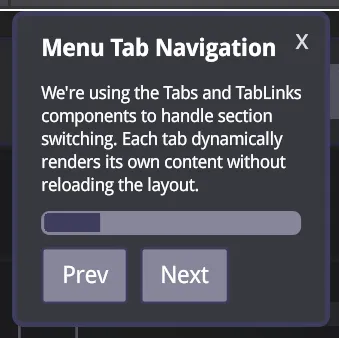
Customizing the tooltip based on the step
A custom tooltip isn’t just about visuals - it can react dynamically to tutorial state.
Because it receives data such as the current step and progress, you can conditionally change its layout, visibility, or behavior.
For example, you can:
-
Adjust its position or width on certain steps
-
Hide navigation buttons on the first or last step
-
Replace button labels dynamically (e.g., show Done instead of Next at the end)
1const CustomTooltip: TooltipType<CustomTooltipProps> = (props) => {2
3    const conditionalClasses = createMemo(() => {4        const classes: string[] = [styles.tooltip];5
6        switch (props.step()) {7            case TutorialSteps.Intro.order:8            case TutorialSteps.End.order:9                classes.push(styles['top-offset']);10                break;11            case TutorialSteps.Structure.order:12                classes.push(styles.wider)13                break;14            case TutorialSteps.Interactive.order:15                classes.push(styles.interactive)16                break;17        }18
19        return classes.join(' ');20    })21
22    return (23        <div class={conditionalClasses()}>24            <h2 class={styles['tooltip-heading']}>{props.title}</h2>25            <span class={styles['tooltip-content']}>{props.content}</span>26            <Progress.Bar class={styles['tooltip-progress']} progress={props.progress()} />27            <Flex>28                <props.Prev29                    class={`${styles['tooltip-control']}30                    ${styles['tooltip-control-first']}`}31                    ${props.step() === 1 ? styles['tooltip-control-disabled'] : ''}>32                    Prev33                </props.Prev>34                <props.Next class={styles['tooltip-control']}>35                    {props.progress() === 100 ? "Done" : "Next" }36                </props.Next>37            </Flex>38            <div class={styles['tooltip-exit']} onclick={props.exit}>x</div>39        </div>40    )41}42
43export default CustomTooltip;
Here, we apply conditional classes based on the active step and modify button text when the tutorial reaches the final step. This flexibility makes it easy to create a tooltip that matches both your visual style and your UX goals.
Interactive steps
Sometimes you’ll want users to perform an action before continuing.
The Tutorial component supports this through programmatic pausing and resuming, letting you create interactive steps that respond to user input.
Making the User Toggle an Option to Continue
In our Menu UI tutorial, we wanted users to enable the “Subtitles” option before moving forward.
To achieve this, we used the pause() and resume() methods from the TutorialRef.
We start by attaching a click listener to the Tutorial component.
When the current step matches the “Interactive” step, we call pause() to stop progress until the correct user action occurs.
Then, we listen for a click on the Subtitles toggle - once the user interacts with it, we call resume(true) to continue to the next step.
1const Menu = () => {2 let tutorialRef: TutorialRef | undefined3 const [Toaster, createToast] = useToast();4 const [interactiveTutorials, setInteractiveTutorials] = createSignal({ subtitles: false })5
6 const MenuContextValue = {7 // Existing context values...8 interactiveTutorials9 }10
7 collapsed lines
11 onMount(() => {12 // Existing code...13 showToast();14 })15
16 // Existing code...17
18 const handleClick = () => {19 if (tutorialRef?.current() === TutorialSteps.Interactive.order) {20 tutorialRef.pause();21 const subtitlesToggle = document.getElementById('subtitles')22 subtitlesToggle?.addEventListener('click', () => {23 setInteractiveTutorials((prev) => ({...prev, subtitles: true}))24 tutorialRef.resume(true);25 }, { once: true });26
27 return;28 }29 }30
31 return (32 <MenuContext.Provider value={MenuContextValue}>33 <Toaster />34 <Tutorial click={handleClick} ref={tutorialRef} outset={5} tooltip={(props) => <CustomTooltip {...props} exit={() => tutorialRef?.exit()} />} >35 {/* Existing Menu UI code... */}36 </Tutorial>37 </MenuContext.Provider>38 );39}This setup ensures the tutorial pauses on the “Interactive” step and only continues once the user has completed the required action.
Passing true to resume() tells the tutorial to immediately advance to the next step after resuming.
Hiding the control buttons until the interactive step is completed
We also created a signal called interactiveTutorials to track whether interactive steps are completed.
This lets us conditionally hide the Next and Prev buttons in our custom tooltip until the user finishes the task.
1import { MenuContext } from "../../../views/menu/Menu"2
3const CustomTooltip: TooltipType<CustomTooltipProps> = (props) => {4 const context = useContext(MenuContext);5
19 collapsed lines
6 const conditionalClasses = createMemo(() => {7 const classes: string[] = [styles.tooltip];8
9 switch (props.step()) {10 case TutorialSteps.Intro.order:11 case TutorialSteps.End.order:12 classes.push(styles['top-offset']);13 break;14 case TutorialSteps.Structure.order:15 classes.push(styles.wider)16 break;17 case TutorialSteps.Interactive.order:18 classes.push(styles.interactive)19 break;20 }21
22 return classes.join(' ');23 })24
25 // Show buttons UNLESS we're on Interactive step AND tutorial hasn't been completed yet26 const shouldShowButtons = () => {27 const isInteractiveStep = props.step() === TutorialSteps.Interactive.order;28 const tutorialCompleted = context?.interactiveTutorials().subtitles;29
30 if (isInteractiveStep) return tutorialCompleted31
32 return true;33 }34
35 return (36 <div class={conditionalClasses()}>37 <h2 class={styles['tooltip-heading']}>{props.title}</h2>38 <span class={styles['tooltip-content']}>{props.content}</span>39 <Progress.Bar class={styles['tooltip-progress']} progress={props.progress()} />40 <Show when={shouldShowButtons()}>41 <Flex>42 <props.Prev43 class={`${styles['tooltip-control']}44 ${styles['tooltip-control-first']}45 ${props.step() === 1 ? styles['tooltip-control-disabled'] : ''}`}>46 Prev47 </props.Prev>48 <NextButton />49 </Flex>50 </Show>51 <div class={styles['tooltip-exit']} onclick={props.exit}>x</div>52 </div>53 )54}55
56export default CustomTooltip;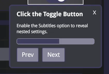
With this logic, navigation controls remain hidden during the “Interactive” step until the Subtitles option is enabled. This makes sure users actually complete the intended action before proceeding.
Guarding against wrong interaction
When using interactive steps, it’s important to handle cases where users navigate backward or repeat actions. For example, if the user goes back to the “Interactive” step after already completing it, clicking the toggle again could pause the tutorial unnecessarily.
To prevent that, we add a simple guard that checks whether the step was already completed before calling pause() again.
1const handleClick = () => {2    if (tutorialRef?.current() === TutorialSteps.Interactive.order) {3        if (interactiveTutorials().subtitles) return;4
5        tutorialRef.pause();6        const subtitlesToggle = document.getElementById('subtitles')7        subtitlesToggle?.addEventListener('click', () => {8            setInteractiveTutorials((prev) => ({...prev, subtitles: true}))9            tutorialRef.resume(true);10        }, { once: true });11
12        return;13    }14}
Now, if the user revisits a completed interactive step, the tutorial will skip the pause logic and continue smoothly.
Conclusion
In this post, we walked through how to integrate the new Tutorial component into the Gameface UI Menu - from defining the tutorial steps and initializing the component,
to building a custom tooltip and adding interactive, user-driven steps.
The full implementation can be found in src/views/Menu/Menu.tsx within the Gameface UI project.
Exploring the Menu UI sample is a great way to see how the Tutorial component can improve onboarding and guide users through complex interfaces with a smooth, in-context learning experience.